
nth系おぼえがき
こんにちは。デザイン戦略部のあおきです。
nth系はいざ使うときに「あれ?なんだっけ?」と思うこともあるのでメモとして残します。
目次
:nth-child(★★)
:first-child、:last-child
:〇〇-of-type
:nth-child(★★)
n番目の子要素を指定してstyleを効かせる。
カッコ内に何番目かを指定する。
数えは1からスタート。
奇数、偶数
:nth-child(odd)、:nth-child(2n+1)・・・奇数番目(1,3,5…)
:nth-child(even)、:nth-child(2n)・・・偶数番目(2,4,6…)
実例
表などで奇数行、偶数行に色を付けて見やすくする
表示
| これ | 奇数 |
| それ | 偶数 |
| あれ | あれ |
| どれ | どれ |
css
.table1 tr:nth-child(odd) { /* 奇数 */
    background-color: #eeeeee;
}
.table1 tr:nth-child(even) { /* 偶数 */
    background-color: #333333;
    color: #ffffff;
}
html
<table class="table1">
    <tr>
      <td>これ</td><td>奇数</td>
    </tr>
    <tr>
      <td>それ</td><td>偶数</td>
    </tr>
    <tr>
      <td>あれ</td><td>あれ</td>
    </tr>
    <tr>
      <td>どれ</td><td>どれ</td>
    </tr>
</table>
★n:★の倍数
例
:nth-child(3n)・・・3の倍数(3,6,9…)
実例
1行に収める要素の数が決まっている場合に、行の最後の要素だけmargin-rightを0にする
表示
- 商品1
- 商品2
- 商品3
- 商品4
- 商品5
- 商品6
- 商品7
css
.list1 {
    display: flex;
    flex-wrap: wrap;
    padding: 0;
}
.list1 li {
    width: calc(33.333% - 8px);
    margin: 0 12px 15px 0;
    padding: 7px;
    list-style: none;
}
.list1 li:nth-child(3n) { margin-right: 0; }
html
<ul class="list1">
    <li>商品1</li>
    <li>商品2</li>
    <li>商品3</li>
    <li>商品4</li>
    <li>商品5</li>
    <li>商品6</li>
    <li>商品7</li>
</ul>
n+★:★番目以降
例
:nth-child(n+4)・・・4番目以降(4,5,6…)
実例
1行に収める要素の数が決まっている場合に、2行目以降にmargin-topを付ける
表示
- 商品1
- 商品2
- 商品3
- 商品4
- 商品5
- 商品6
- 商品7
- 商品8
- 商品9
- 商品10
css
.list2 {
    display: flex;
    flex-wrap: wrap;
    margin: 15px 0;
    padding: 0!important;
}
.list2 li {
    width: 33.333%;
    padding: 7px;
    list-style: none;
}
.list2 li:nth-child(n+4) { margin-top: 15px; }
html
<ul class="list2">
    <li>商品1</li>
    <li>商品2</li>
    <li>商品3</li>
    <li>商品4</li>
    <li>商品5</li>
    <li>商品6</li>
    <li>商品7</li>
    <li>商品8</li>
    <li>商品9</li>
    <li>商品10</li>
</ul>
★n+●:★の倍数+●
例
:nth-child(3n+1)・・・3の倍数足す1(1,4,7…)
実例
1行に収める要素の数が決まっている場合に、行の最初の要素だけmargin-leftを0にする
表示
- 商品1
- 商品2
- 商品3
- 商品4
- 商品5
- 商品6
- 商品7
- 商品8
- 商品9
- 商品10
css
.list3 {
    display: flex;
    flex-wrap: wrap;
    padding: 0!important;
}
.list3 li {
    width: calc(33.333% - 8px);
    padding: 7px;
    list-style: none;
    margin-left: 12px;
}
.list3 li:nth-child(3n+1) { margin-left: 0; }
html
<ul class="list3">
    <li>商品1</li>
    <li>商品2</li>
    <li>商品3</li>
    <li>商品4</li>
    <li>商品5</li>
    <li>商品6</li>
    <li>商品7</li>
    <li>商品8</li>
    <li>商品9</li>
    <li>商品10</li>
</ul>
:nth-last-child:最後から数えて
:nth-last-child(★★)もあります。この場合は最後から数えて★★番目、という指定になる。
カッコ内に指定するものは上記と同じ。
その他
使いどころはあまりないけどこういう指定もある。
:nth-child(4)・・・4番目
:nth-child(5n-1)・・・5の倍数引く1(4,9,14,19…)
:first-child、:last-child
最初、もしくは最後の要素にstyleを効かせる。
:first-child 実例
最初の要素だけmargin-top:0;にする
表示
- 商品1
- 商品2
- 商品3
css
.list4 {
    padding: 0!important;
}
.list4 li {
    padding: 7px;
    list-style: none;
    margin-top: 10px;
}
.list4 li:first-child { margin-top: 0; }
html
<ul class="list4">
    <li>商品1</li>
    <li>商品2</li>
    <li>商品3</li>
</ul>
:last-child 実例
最後の要素だけmargin-bottom:0;にする
表示
- 商品1
- 商品2
- 商品3
css
.list5 {
    padding: 0!important;
}
.list5 li {
    padding: 7px;
    list-style: none;
    margin-bottom: 10px;
}
.list5 li:last-child { margin-bottom: 0; }
html
<ul class="list5">
    <li>商品1</li>
    <li>商品2</li>
    <li>商品3</li>
</ul>
:notで最初以外、最後以外
最初の要素以外、もしくは最後の要素以外marginをつけたい、という場合には:notを使う。
※使用例の表示は割愛。:first-child、:last-childと同じになります。
コード例:最初の要素以外
.list6 li:not(:first-child) { margin-top: 10px; }
コード例:最後の要素以外
.list6 li:not(:last-child) { margin-bottom: 10px; }
:〇〇-of-type
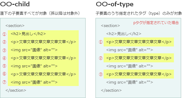
childとof-typeの違い
:nth-of-type、:first-of-type、:last-of-type
〇〇-childと似たような記述でよく混ざってしまう記述。
〇〇-childの場合は、子要素すべて含めての上から順に1,2,3という順番になる。タグの種類は関係ない。
〇〇-of-typeとなった場合は、子要素のうち、指定されたタグの中で上から何番目か、の指定になる。
●:first-of-type
※:first-of-type の使用頻度が圧倒的に高いので、:nth-of-typeと:last-of-typeは割愛
●で指定した要素のうち最初に出てきたものにだけ効かせる。
●はclassやid名も指定できるが、より複雑になるのでお勧めはしない。タグで指定するのが◎。
例
h2:first-of-type・・・最初のh2だけpadding-top:0
※わかりやすくするためにpaddingにしているが、実際にはmarginを0にする使い方のほうが多い。
h2:first-child でもよいのでは?と思いがちだが、今回の例の場合は「説明文(pタグ)」が最初の子要素(first-child)になるので h2:first-child では効かない。
h2が最初の子要素になる場合は h2:first-child でもOK。
表示
コンテンツですよという説明文
見出し1
あーだこーだ
- あれ
- それ
見出し2
そーだどーだ
- どこ
- そこ
見出し2
そーだどーだ
- どれ
- これ
css
.contents1 {
    padding: 10px;
    margin-bottom:15px;
    border: 1px #cccccc solid;
    background-color: #eeeeee;
}
.contents1 h2 {
    margin: 20px 0 10px;
    background-color: #ffffff;
    color: #333333;
}
.contents1 h2:first-of-type {
    padding-top: 0;
}
html
<div class="contents1">
    <p>コンテンツですよという説明文。</p>
    <h2>見出し1</h2>
    <p>あーだこーだ</p>
    <ul>
        <li>あれ</li>
        <li>それ</li>
    </ul>
    <h2>見出し2</h2>
    <p>そーだどーだ</p>
    <ul>
        <li>どこ</li>
        <li>そこ</li>
    </ul>
    <h2>見出し2</h2>
    <p>そーだどーだ</p>
    <ul>
        <li>どれ</li>
        <li>これ</li>
    </ul>
</div>